Archive

Page 33 of 95

Freehand For Fantasy, Reference For Realism; Or, On Fine Disregard For Rule

Art thrives when free from rigid rules, just as education flourishes when curiosity guides learning rather than preset sequences; both fields become stale when boxed in by schedules and expectations—like a processed sausage aimed only at graduation. In art, letting the canvas bloom like a seed nurtures genuine creation, while forced patterns render works alien and artists stagnant. Thus, whether painting or studying, allowing joy and spontaneity to guide progress elevates the artist’s growth and enriches life.

Art Smart; or, The Power Of Seeing

The post celebrates the accessibility and transformative power of creating art, encouraging readers to start simply with their heart and basic shapes—such as drawing or photographing a familiar subject like a fat cat—and then layering or projecting these forms to explore negative space and composition. It frames art as both an escape and a learning experience that can make one “art‑smart” by the time they reach their fortieth project, while also offering philosophical insight with a nod to Descartes’ famous dictum. Overall, it presents art as a personal educational journey that brightens life, inspiring readers to keep adding moments of creativity day after day until they become “Great Beings.”

The Shiny Pug, Or Coloring Line Art

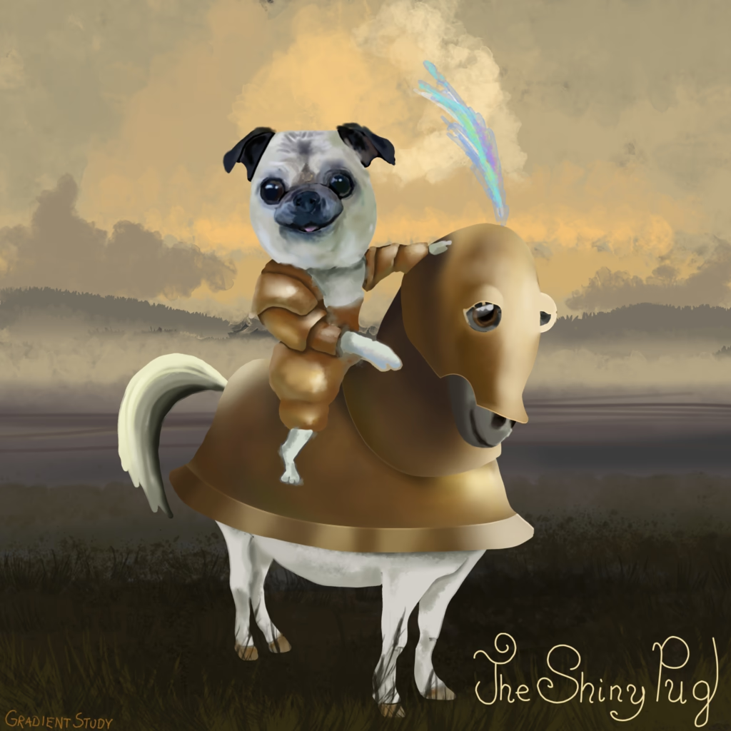
In this post the author explains how to color a computer‑drawn illustration while keeping line art intact: use a very thin brush or the contiguous selection tool with its “grow” option so that fills extend just beyond the lines and avoid holes; then paint over the selected area, keep the line layer above the fill, and optionally merge the two layers for a clean result. The technique combines quick selection‑based filling with careful brushing to produce smooth gradients without gaps or unwanted overlap, making it ideal for both outlined and fully painted artwork.

The Great Pajama Ride, Or How To Finish Your Art

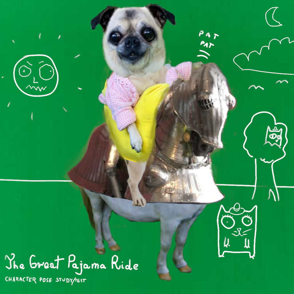
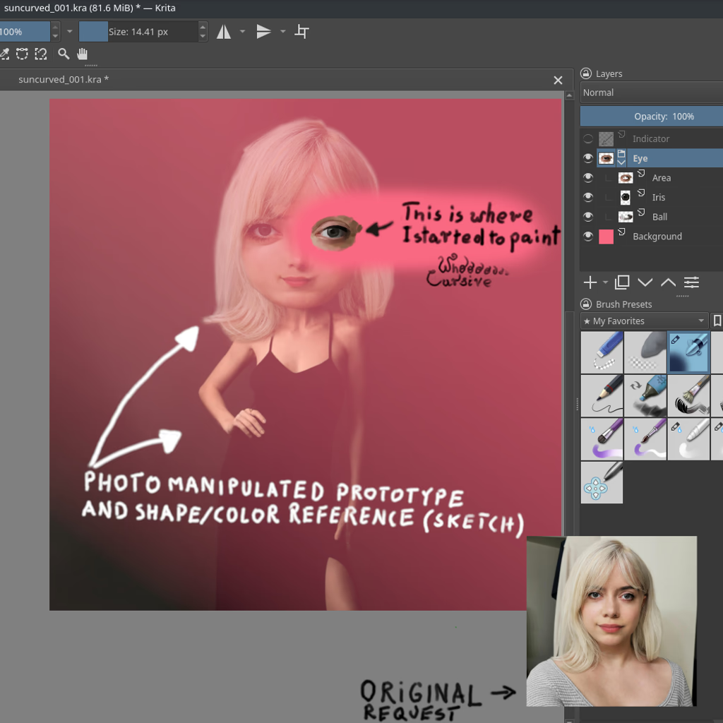
The post outlines a step‑by‑step process for creating a finished illustration that blends photo‑manipulation with hand‑drawn and painted elements. It begins by building a scene from a photograph, then sketching precise line art that stands on its own but also supports the overall composition. After establishing clean lines, the artist adds flat colors or gentle shadows—sometimes using gradients—to give depth. The next phase is painting: starting with a black‑and‑white value study and glazing over it, or applying color directly from the manipulation. Color mixing relies on local colour principles, adjusting hues to match surrounding tones before adding subtle highlights. Finally, the artist infuses “magic” by working within the atmosphere of the scene—glowing eyes, opal skin, etc.—to finish a polished illustration that feels complete and alive.

Never Pugnacious, Always Gracious

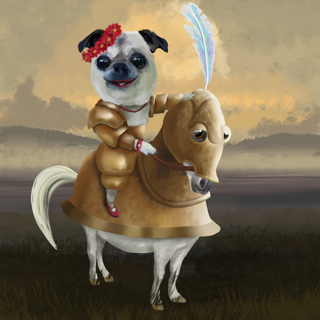
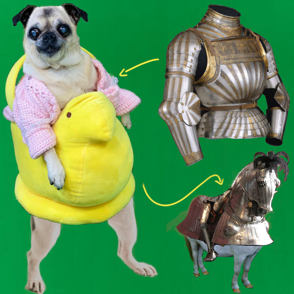
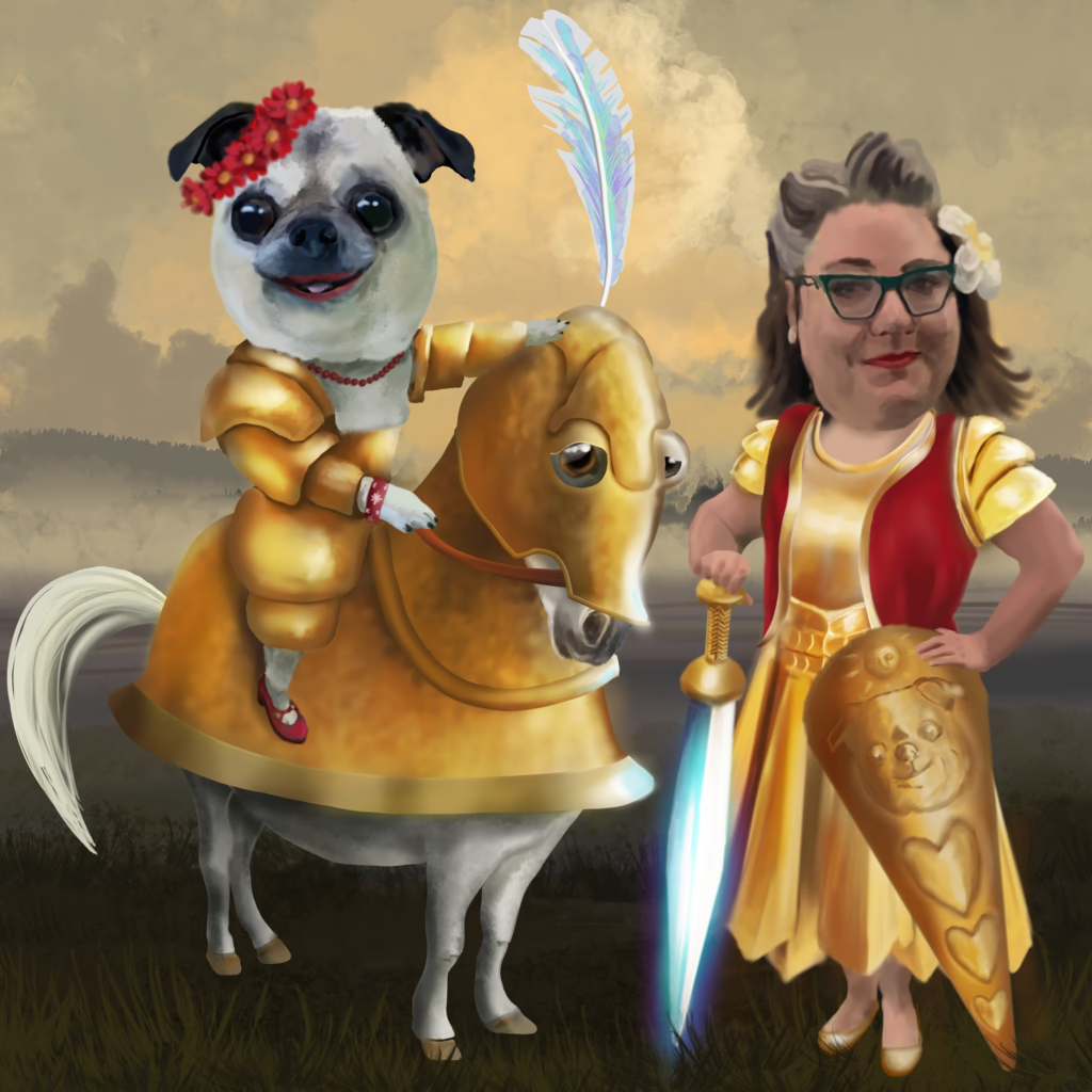
The post celebrates an imaginative “Queen of Queens” who commands the world of pets—squirrels, dogs, and cats alike—by encouraging them to wear tiny hats as part of a golden age of pet fashion. She is portrayed as both a charming scientist and artist, riding a little horse in golden armor while delighting in cozy wool sweaters at home. Her cheerful presence lights up rooms from afar, and she loves to listen to her favorite books, especially those by Bill Bryson, all while maintaining her role as the keeper of doggie things.

Of Poses And Worlds

The author explains a technique for creating drawings by first sketching a simplified model over a source image—marking distances and relative measurements—and then recreating that minimal sketch on an empty canvas using only the photo, a drawing surface, and traditional brushes. This method can be applied to faces or bodies (with key points such as knees, joints, shoulders) and transferred onto a blank canvas; the writer prefers artists to use their judgment on a slightly warped reference rather than relying solely on line models, believing that a faithful likeness is only one small detail among broader elements like armor or scenery. They note the importance of capturing key features—such as eyes—before adding other details, and enjoy creating large scenes with 3D modeling to guide composition, appreciating how digital tools help map out complex worlds for painting.

Lecture Two: Enhancing Your Reference Images

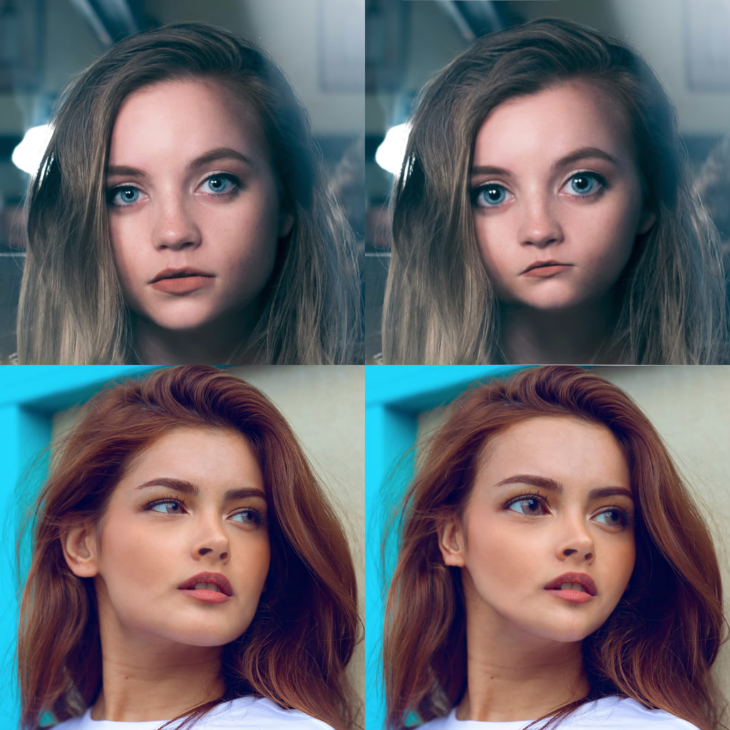
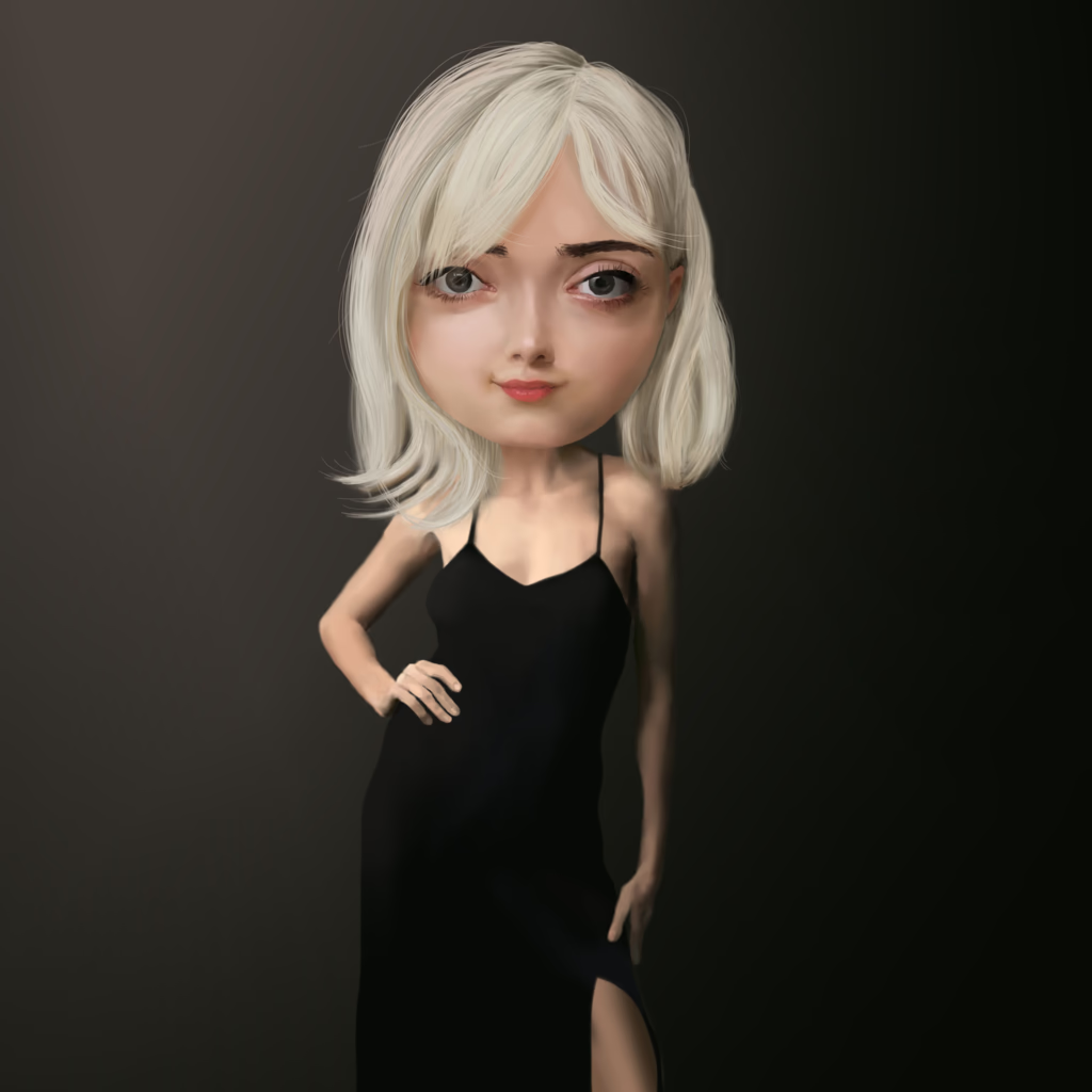
Step‑by‑step GIMP tips for gently warping faces into youthful, balanced proportions—paired with a nostalgic recounting of the author’s first photo‑manipulation projects and a call to share this art with classmates.

Tiny Little Art Lice: Don't Let Liars Stop You From Learning

The post describes how artists who use photographs as references often face early criticism—labelled “copying” or “paint‑over”—from traditionalists who consider such practice unoriginal; it explains that these attacks, usually launched by self‑confident “liars,” can be overcome by stepping outside their circle and mastering the tools (e.g., GIMP’s Warp Transform) to create truly beautiful works; the writer encourages artists to keep learning, reinventing rather than merely copying, and to rise above the noise so that art becomes a free, living forest rather than an echo chamber.

A Tiny Little Introduction To Digital Paining (Recap And Lecture Practice)

Digital painting in Krita can begin with hyperrealism, using a pen-and-tablet setup that supports tilt so the virtual chisel tip rotates naturally; layer management lets you isolate elements like eyes or shadows for precise control; the built‑in Image Reference Tool projects an image (e.g., a selfie) over your canvas at adjustable opacity, allowing you to trace shapes with an airbrush while simultaneously sampling exact colors from the reference layer; by ensuring high‑resolution photos—visible details such as individual eyelashes—you can accurately learn both color and form in a quick, pleasant workflow.

Hyperrealism vs. Super Realism

Accurate photo reference is essential for realistic portraiture because subtle details such as iris lines, eyelid color and horizon processing shape our perception of faces, and mastering these nuances yields a “super realism” that beautifies human features without distortion.

What The Doodle Is A Value Study?

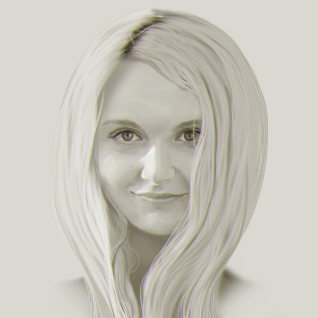
The post explains a fast digital painting workflow that begins with creating a black‑and‑white version of an image to establish its value (brightness) study, then adding a color layer in “Color” mode so that the computer replaces each pixel’s value with the underlying grayscale values while keeping the chosen hue. By first laying out shadows, midtones, lights and highlights on the monochrome base, the painter can later apply any desired color—whether it’s flesh tones or other hues—without worrying about saturation because the tonal information comes from the lower layers. This technique mirrors traditional value‑studies used by Old Masters but streamlines the process for modern graphic programs.

Why Snow: Summer Will Be Delayed Until The Groundhog Gets Paid

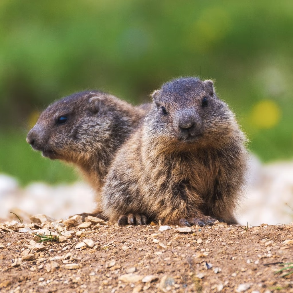
The post whimsically describes a Groundhog who controls the weather, predicting that it will change only after he receives his tax return; the narrator humorously details the Groundhog’s needs—money, diamonds, and even trout—to keep the cycle going, suggesting that as long as the creature has enough resources, it will continue to bring winter’s snow until the spring arrives.

United Countries Of The World

Poverty and war shape the way we see ourselves, while our birthplace determines our religion, intelligence, and sense of safety—yet these are not who we are but what culture impresses upon us. The road humanity walks is paved by those who accept contradictions; it isn’t perfect, but it beats a world of imagined borders and endless wars. Science is ignored, liars win politics, and poverty’s grip on the mind produces divisions based on skin color, faith, or invented lineages—divisions that can be healed only by learning, art, and courage. By reading books and seeking wisdom we become great beings; our responsibility is to end poverty, build a culture of education, and prevent wars for decades to come.

The Right Angle: The Biggest Problem In Art

The post explains that recognizing faces in real life relies on many angles, whereas a single photo gives only one view that can be further distorted by lenses, software, lighting, focus, color, and expression; to overcome this, the author suggests using photogrammetry with neutral lighting and free tools such as Meshroom, Blender, and Prusa Slicer to build a 3‑D model of a portrait, which then allows you to see the subject in three dimensions and understand its main angle—so even if your painting starts from one photo, you should gather several minutes of video and dozens of photos taken at slightly different angles and lighting. The author notes that seeing multiple shots can sometimes make people look like twins, a common problem in art when reproducing the wrong “twin.” Finally, he argues that stylised paintings are as valuable as hyper‑realistic ones; capturing a stylised eye while keeping the subject’s appearance takes time but is part of learning and bridges the journey from hyper‑realism to beautiful stylisation.

Your Art Journals Are Precious

The poem celebrates the endless directions of art, describing each painting as a gateway to a new story told in its own style—whether night‑lit, misty mountains, or sunny faces—and noting how photographs can serve as foundations for these works. It reflects on the many languages of artistic expression that evolve over time, with artists learning through repeated attempts and building upon earlier styles, while sharing their journeys helps others follow the creative path.

Artistic Meows

The post reflects on the artist’s evolving practice: starting from a freehand sketch that landed a blue nose close enough to a cucumber shape, the writer notes that twenty portraits seem like a “magic number” for honing technique. They claim sculpting was surprisingly easy and error‑free, yet freehand still falls short of capturing real people, faces and places—so practice through mastering masterpieces is essential. The next phase involves painting metal, glittery makeup or shiny dresses, especially armor that reflects light and feels majestic; gold’s hue emerges from a mix of six colors with reflective quality. Painting portraits extends beyond the face: filling all space to tell stories of superpowers, mystery, glory, and making the owner smile through colorful style. The writer concludes perfect portraits are just the start of mastery, urging painters to keep refining and painting rather than relying on photos.

Three Scary For Me: How Art Can Bite You

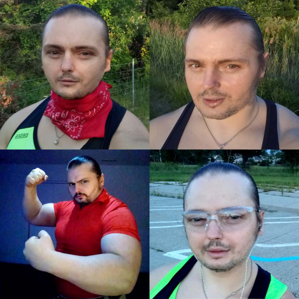
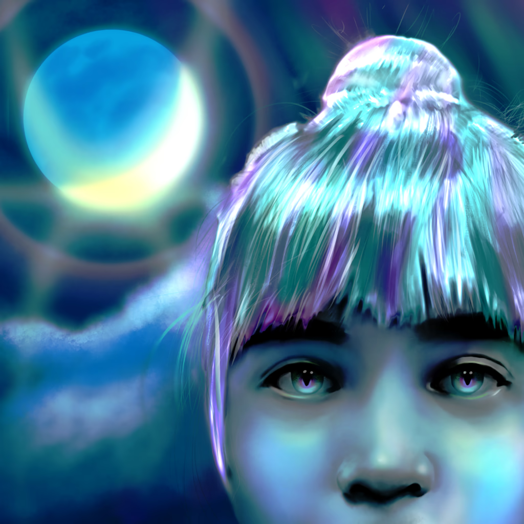
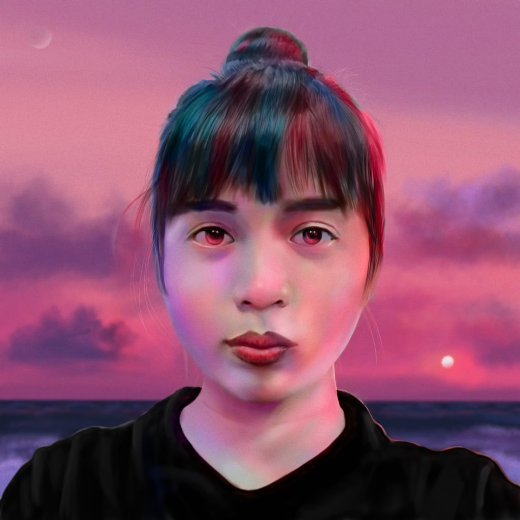
After a workout I found myself inspired by the glowing eyes of digital fantasy art and tried to apply that effect to a portrait of my own face. The initial result—blue‑glowing skin—looked striking, but after reflecting on how the subject would feel it became too dramatic and unprofessional; removing most of the glow brought back recognizability while keeping the idea of a “powerful guardian.” I learned that adding glow isn’t just about brightening—it’s about layering subtle color swipes over a dark background to create a natural light, and that less is more. Using reference photos keeps faces from becoming distorted, and when painting at night you can give a magical feel with careful color choice: blue gives a cold, alien tone while red feels warm and friendly. The post concludes that if a client asks for a nighttime portrait, it’s an opportunity to produce a fairy‑like image—provided the subject knows what they’re getting—and that the artist must respect the person being painted before adding such glowing effects.

Fixing Programming, Or, Building Your First Trillion Dollar Company

The post contrasts low‑level and high‑level programming languages, emphasizing how higher‑level languages let developers work with objects like windows and files instead of raw hardware calls. It explains that in object‑oriented systems you can create UI elements (e.g., a window that opens when its title exceeds two words) and chain actions through before/after hooks, building more complex objects from simpler ones. The author then describes an envisioned platform where developers use simple “packages” to encapsulate tasks—such as converting images or generating programs—which bots automatically process in a pipeline of rooms (like assembly lines). The architecture relies on distributed self‑provisioning servers and pixel‑art UIs, with users, bots, and factories collaborating to automate workflows without leaking abstractions.

Don't Let Art-Liars Trick You: You Are Already An Artist

The post argues that many art schools teach “color‑picking” and “paint‑overs” as if using original hues or reference images were wrong, and they fail to show the beauty of capturing light through a lens or a camera file. The author claims true shape work needs photogrammetry or 3D modeling—not simple grids—and that teachers who claim credit for this process are merely elevating themselves. By using real colors and references one can unlock a powerful “teacher” inside each artist, rather than being shamed into elitist tricks; the writer cites Richard Dawkins as an example of how to counter such critics with a video link. In short, the post urges artists to use genuine color and accurate shape capture to break free from school‑shaped shame and reclaim their innate artistic power.

Building Masterpiece Paintings

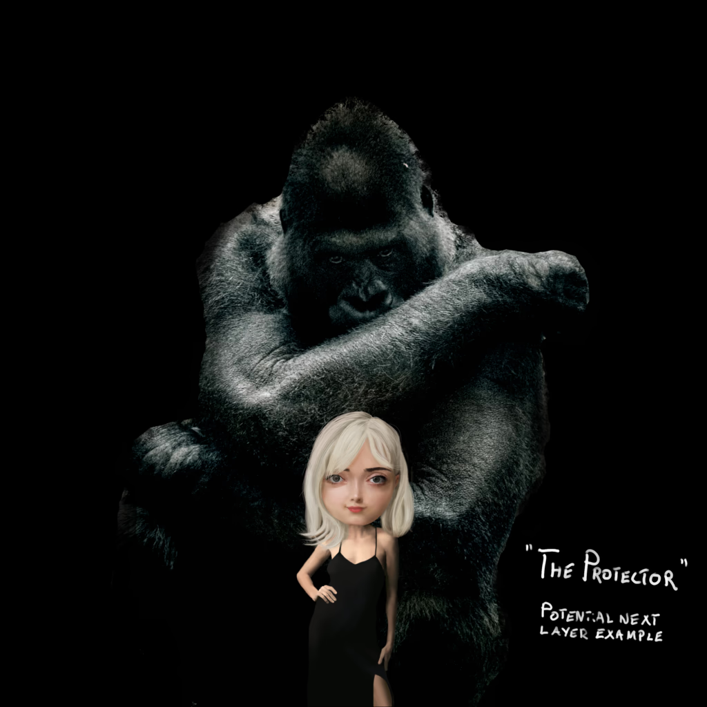
This post argues that painting should be approached by layering—starting with basic elements such as face, body, and background—and building the image stepwise rather than committing to a full sketch first. By treating each layer as an interactive decision, the artist can adjust pose, attitude, and composition on the fly, much like playing chess or conversing with the work itself. The author contrasts this method with traditional school practice of laying out the scene in advance, claiming that true composition evolves through continuous mediation. In digital painting, the canvas is effectively infinite and the brush can render microscopic detail, giving the artist a “superpower” to refine and reshape the image at any time, echoing Leonardo’s desire for precision yet allowing modern flexibility beyond his era’s tools.

Seventy Five Days And Seventeen Paintings

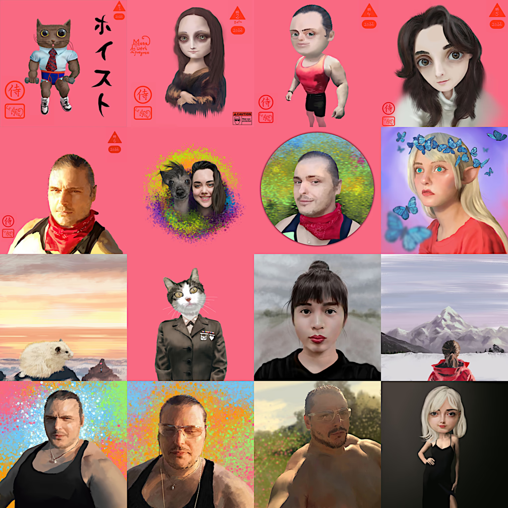
The author reflects on a disciplined painting routine—two days of work, two days of rest, producing a new canvas every four days over a 75‑day span—and shares sixteen pieces as evidence of their process. They feel alienated from the art community, having been banned from a forum after criticizing “art teachers” and plan to publish pictorial tutorials (infographics rather than videos) covering Impressionism, Hyperrealism, and Pop Surrealism, hoping students can jump straight into advanced styles without basic exercises. The post asserts that these sixteen works represent true results of real education and defines a masterpiece as a multi‑character scene that baffles viewers, invites copies, and “has legs.” Finally, the writer imagines an ideal masterpiece that would illustrate global progress beyond poverty, climate change, and war, serving as a concept map for collective growth.

Sitting In A Chair Learning To Paint Hair

In this poetic post the author reflects on the art of painting hair, noting that successful portraits require capturing hair’s structure and shine with precise brushwork—often using an airbrush rather than individual hairs—and that each style demands careful layering of strands to avoid flatness. He explains that while quick sketches can suffice, true fidelity comes from meticulous attention to detail, especially when viewing reference photos, and he encourages artists to keep practicing and trust their hearts. The post concludes with links to a title image contest entry, a related contest submission, and a time‑lapse video of the painting process.

The Triumphant Painter

The post outlines a detailed multi‑step workflow for creating high‑value digital paintings: it starts with selecting a cohesive theme for a series, then builds photo‑bashing prototypes and advanced digital sketches that serve as precise color and shape references; these layered images guide the final painting, which is finished either as a single copy or in limited runs (e.g., 500 copies) and paired with custom frames that echo the series’ concept. The process emphasizes using digital tools to keep layers intact, experimenting with techniques like printing on multiple panes of glass for depth, and ensuring meticulous precision throughout. It stresses the importance of a smooth workflow—from initial photo‑bashing through final execution—so the artist can focus on client portraits without frustration. The post also highlights how selling such work under tight deadlines can drain joy but points to financial benefits that support life’s essentials. Finally it encourages drawing inspiration from literature, films, and cartoons to weave a unified pop‑surrealist narrative that captivates galleries, proving digital painting as an upgrade—not replacement—of traditional art.

Tea And Biscuit, Or How To Paint A Perfect Selfie Portrait

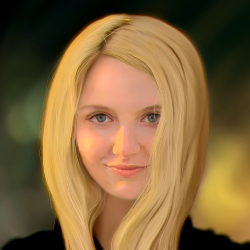
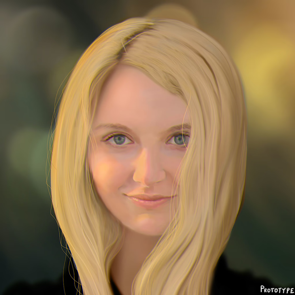
The post explains how to turn a simple outdoor sketching session into a polished digital painting: start by gathering the right tools—bike, camera or phone with wide‑angle lenses, and plenty of snacks—and head out to a sunny park where you’ll take several reference photos under natural light, aiming for strong shadows and highlights. Once you have your shots, open Krita, overlay them at 50 % opacity to guide shape and color, tweak the photo’s temperature if needed, then sharpen and add subtle noise before painting. By combining careful preparation, good lighting, and a solid reference workflow, you’ll capture expressive line art that feels natural and full of atmosphere.